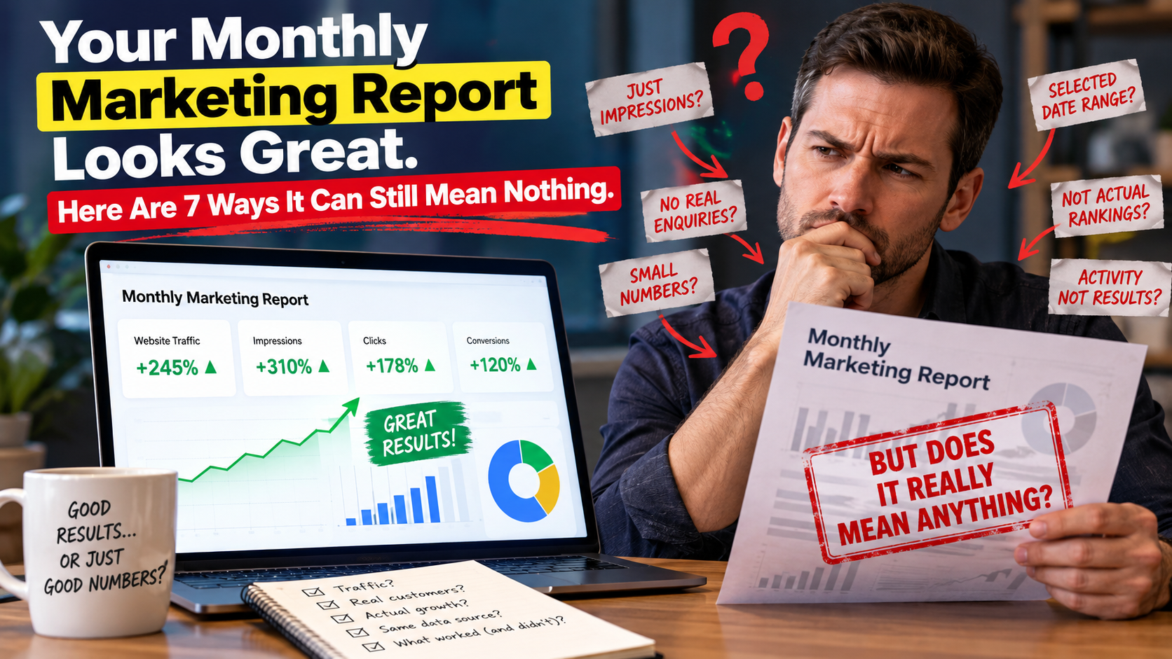
Every month a report lands in your inbox. Green arrows, a few charts, words like momentum and optimisation. You skim it, you feel vaguely reassured, and you approve the next invoice.
Here is the uncomfortable part: almost every number in that report can go up while your business gets nothing. Usually nobody is lying. It is simpler than that — the metrics that are easiest to grow are the ones that matter least, and they are the ones that end up on slide one.
Below are seven patterns worth recognising. None of them require you to learn marketing. Each one needs a single follow-up question.
1. A percentage with no number behind it
Click-through rate up 300 per cent sounds enormous. It can also mean your click-through rate went from 0.1 per cent to 0.4 per cent, which on a small site might be four extra clicks. Percentages are how small numbers are made to look large.
Ask: what were the actual numbers, before and after?
2. Impressions and reach presented as results
An impression means something appeared on a screen. It does not mean it was read, noticed, or wanted. Reach and impressions are the cheapest numbers in marketing to grow, because they can be bought.
They are not useless — they tell you whether you are visible at all. They are just the start of the funnel, never the end of it.
Ask: how many of those impressions became clicks, and how many of those clicks became enquiries?
3. A date range somebody chose for you
Any month looks good next to a bad one. If your business has a slow season, comparing the busy month against it produces a chart that has nothing to do with the work performed. The same trick works in reverse: a genuinely bad month gets compared to a worse one.
Ask: can I see the last twelve months on a single chart, instead of a comparison of two?
4. Average position treated as your ranking
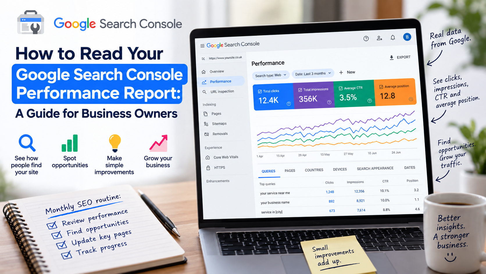
Average position in Search Console is an average across every query you appear for, weighted by impressions. It is not your rank for the keyword you care about.
It moves from 28 to 19 and looks like progress, and it might be — but it is still nowhere near page one. Worse, average position can improve when you stop appearing for difficult keywords, because the hard queries dragging the average down have simply disappeared.
Ask: which specific queries moved, and where do we rank for the three that actually bring customers?
5. Sessions, users and clicks used as if they mean the same thing
They are three different counts from two different systems. Search Console clicks and Analytics sessions will never match, and they are not supposed to: the tools define events differently, one counts only Google search, cookie consent and ad blockers remove people from Analytics, bot filtering differs, and Search Console reports on a delay.
A report that quietly switches between them can show growth that is only a change of measuring stick.
Ask: which tool is this number from, and is it the same tool as last month?
6. Screenshots with the filters cropped out
Every one of these tools lets you filter by date, device, country, query and page. All of those filters are visible on screen — and all of them are easy to leave outside the edge of a screenshot.
This is rarely malicious. It is just that a cropped image cannot be checked, and anything that cannot be checked should not be the basis of a budget decision.
Ask: can you send the export or share dashboard access instead of an image?
7. Activity described as outcomes
Published 12 blogs. Posted 40 times. Built 25 backlinks. Sent 6 newsletters. This is a description of effort, and the effort is genuinely being spent — but it is an invoice justification, not a result.
Twelve articles nobody found is not twelve times better than one article that ranks.
Ask: of those twelve, which ones brought traffic, and which brought enquiries?
The five-minute check you can run yourself
You do not need anyone to hand you these numbers. Three free tools, and the accounts should be in your name, not your agency’s:
- Google Search Console — clicks, impressions and the queries you actually appear for. How to read it in plain English.
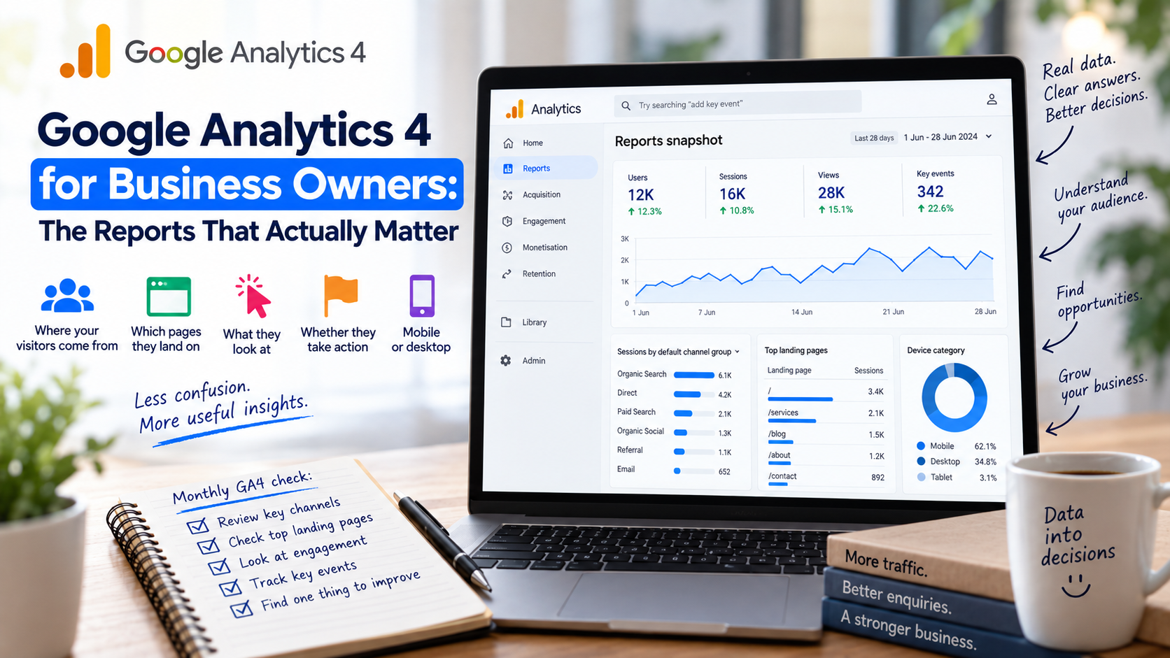
- Google Analytics 4 — what people did once they arrived. The reports that actually matter.
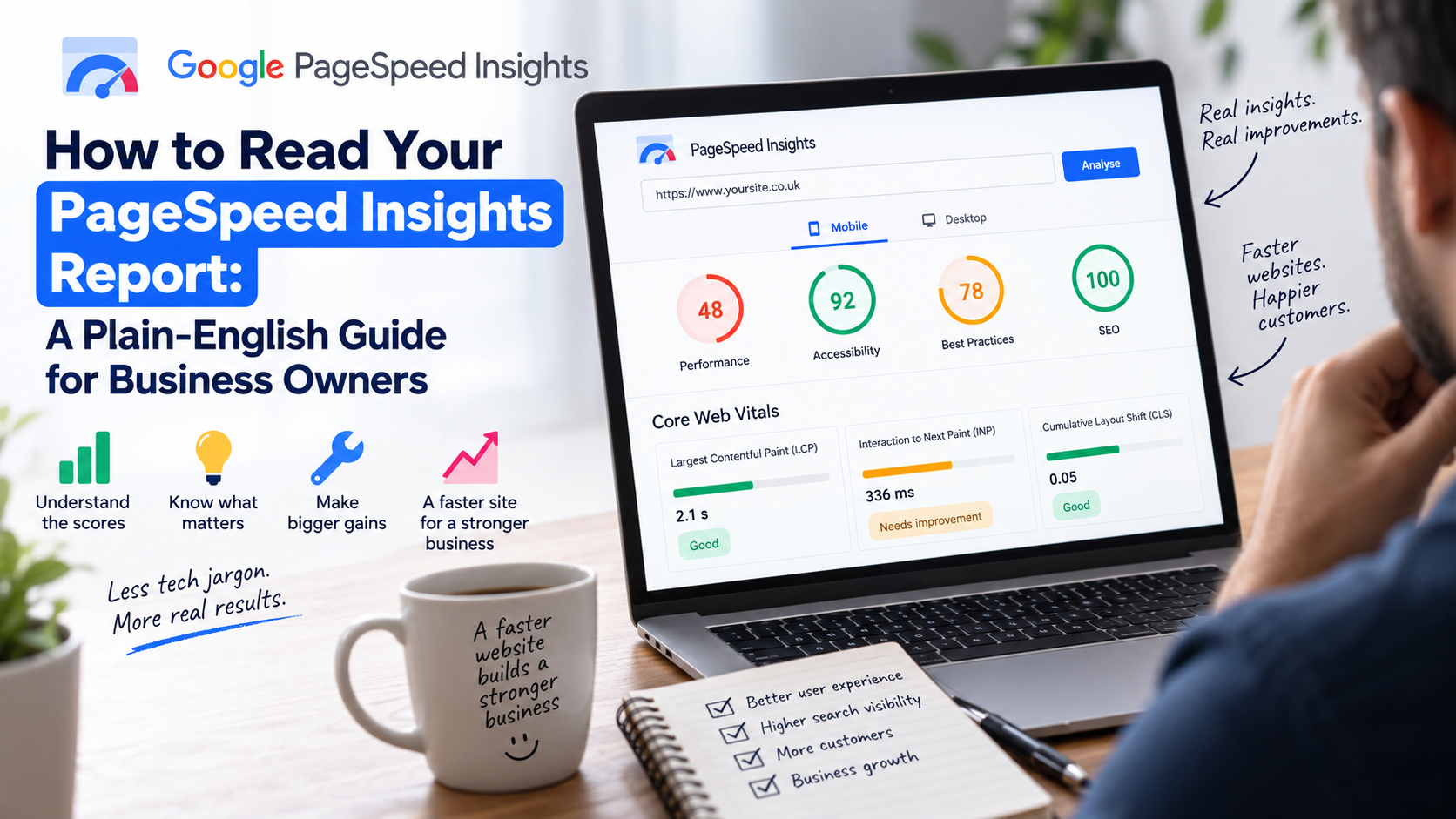
- PageSpeed Insights — whether your site is fast enough to keep the visitors you paid for. A plain-English guide.
If your accounts are owned by someone else, that is the first thing to change. Ownership of your own data is not a technical detail — it is the difference between checking a report and trusting one.
What a good report looks like
- Absolute numbers sitting next to every percentage.
- The same date range, every single month.
- At least one line about enquiries, calls or purchases — not only traffic.
- Named queries and named pages, rather than totals alone.
- Something that was tried and did not work.
That last one is the real test. Marketing is largely experiments, and most experiments fail. A report with no failures in it is not a report of the work — it is a highlight reel.
A good marketer tells you what went wrong before you ask. It is the clearest signal you are being shown the whole picture.
See it in your DMB-One dashboard
DMB-One connects your own Search Console, Analytics and PageSpeed accounts and puts them in one view, so you are reading the same numbers your marketer is reading, from the same source, over the same date range.
We do not invent metrics and we do not score our own work. If a number cannot be traced back to Google, it does not appear on your dashboard.